 |
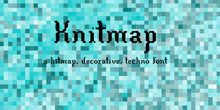
The design of the Knitmap font family was inspired by a logo stitched on the elastic band of a pair of shorts. This was at the time when Flash was very popular with its usage of bitmap fonts.
 |
The design of the Knitmap font family was inspired by a logo stitched on the elastic band of a pair of shorts. This was at the time when Flash was very popular with its usage of bitmap fonts.
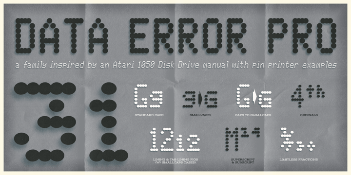 |
The Data Error AOE Family was one of my earliest typefaces, at a time when I had become obsessed with all forms of "digital/techology" typestyles. It's been awhile since the early 2000's, but I've had a hankering for awhile now to revisit this typeface, giving it a more expansive language character set and fill it out with some Opentype features.
Inspired by some old printouts of BASIC programs and an Atari 1050 Disk Drive manual with pin printer examples, comes the familiar yet oddly restricted style with this Data Error family. This family comes complete with Regular and Bold versions with their respective Oblique versions. Odd pin printer restrictions inherent in this typeface are: no characters extend below baseline or above ascender line, (except international accents).
A nostalgic typeface for computer programmers everywhere, strong and legible at any size, Data Error is perfect for so many purposes, get it today!
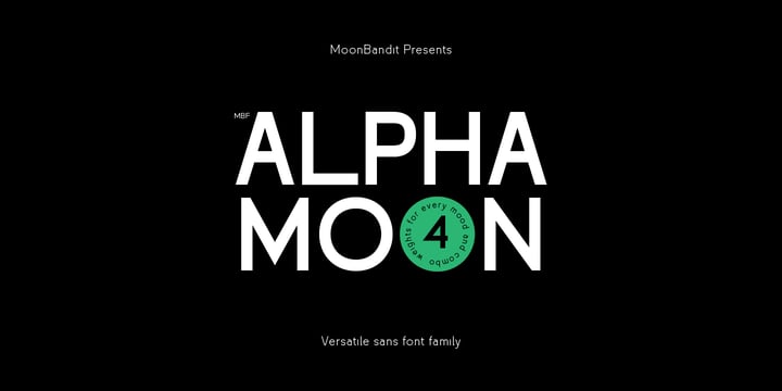 |
AlphaMoon is a very versatile all-rounder font family. This typeface is crafted to be a go-to font for multi purpose project. From logo, poster, headline, text, editorial, you name it, AlphaMoon can handle it. This type family also comes in 4 weights, capable to achieve contrast in the work.
 |
AlphaMoon is a very versatile all-rounder font family. This typeface is crafted to be a go-to font for multi purpose project. From logo, poster, headline, text, editorial, you name it, AlphaMoon can handle it. This type family also comes in 4 weights, capable to achieve contrast in the work.
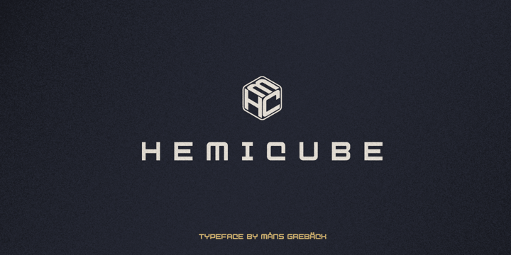 |
Hemicube is a geometric logotype font, created by Mans Greback in 2020.
Its futuristic lettering follows a mathematical pattern while being minimalistic and clean, which makes in work perfectly in sci-fi or technology context graphics.
It is a three-style typeface family; in addition to the regular Hemicube style, it also comes as a basic Type style as well as a monogram Logo style.
In the Hemicube Logo font, write any three capital letters to make a cube monogram. Example: ABC
Use underscore to create a logo with fewer letters. Examples: A_B _CD _E_
It has a very extensive lingual support, covering all European Latin scripts.
The font contains all characters you'll ever need, including all punctuation and numbers.
 |
FS Industrie is a systematic typeface.
An extraordinarily versatile new type system, with 70 variants built around five different widths and seven different weights.
Stylistically, FS Industrie feels direct and simple without sacrificing its humanity. It takes inspiration from German fonts of the 1930s, with their roots in manufacturing and signage. Each width and weight is drawn with subtle variations as you progress throughout the system, ensuring that each variant plays to its unique strengths. FS Industrie is a response to the changing nature of type, for brands responding to the changing nature of work.
 |
 |
 |
 |
 |
 |
| |
 |
 |
 |
©
Seraphim Lavrentyev
2014 . Powered by
Blogger
Blogger Templates
.
.